Since late January I have been working and collaborating with a great team who has been very busy re-designing The Collaborative for Educational Services website. The new site was launched July 1! Yeah team.
As I came into the team my involvement has been on several levels; creating wireframes for the architecture [I used Mockingbird], assisting with understanding the business flow and work impact the new website has on the various departments in The Collaborative and uploading content into the Drupal content management platform. Along the way there have been thousands of details to attend to, lots of problem solving with the front end developer, content specialists and our Communications Director.
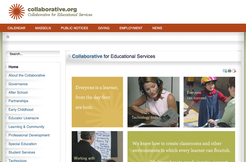
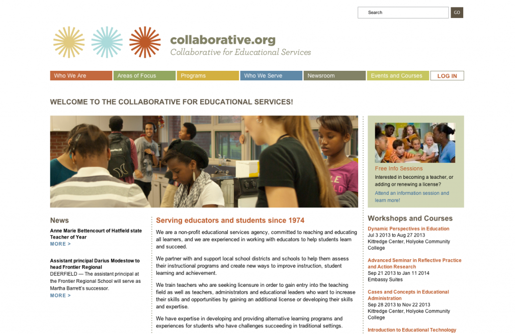
It has been a lot of fun and I still have content uploading to assist with along with finalizing style guides and user manuals. However, I wanted to share the before and after images of the website.
Can you see a difference? Tell me what you think in the comments below.
Here is what the old Collaborative website looked like:
 And here is what the new Collaborative website is now looking like: users can now register and pay for course and events online. Our content is more logically organized and I feel, much nicer to view and move around in.


