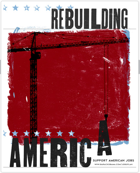
Obama for America invited artists from across the country to volunteer their creativity to support President Obama’s jobs plan and the campaign. Now it is time to vote. Luckily, you get 3 chances to vote. Here’s my favorite, from Julie, Seattle, WA.
 I love this one because of the bold use of color, which draws the eye into the design [you’d see this one from across the street]. Julie has cleverly manipulated the typography to ‘work’ and communicate the idea of jobs and she placed the crane image perfectly to allow our eyes to ‘move’ through her design. Julie also complimented the poster by repeating the iconic star [in blue] and allowed just enough of the blue, behind the red to peek out. Was she symbolizing the ‘blue skies’ of new jobs coming to America?

