Uncategorized
MultiMedia in the Learning Experience
I’ve been having an ongoing discussion with colleagues about the use of multimedia in the learning experience. I am a big proponent of the use of visuals and multimedia within the learning experience, as I feel it helps to augment the understanding. I am always looking for new ways to communicate visually.
However, playing Devil’s advocate: Just last night I had a continuation of this household’s ongoing discussion–the topic of homework– which I have been having for years now, with my daughter Xernay [who just turned 16]. I always argue how much easier it is to be a high schooler these days–writing and doing research & homework–because of the internet and access to all the information, visuals, and multimedia out there. Then I go into the long blah, blah, about how I had to write out notes, use actual books [gasp], go to the public library, type on a typewriter [with an eraser]…….you get my gist.
And The Girl [one of her many nicknames] is in her bedroom, laying on the floor, peering into her open MacBook, video chatting with some dude named Jack, and they are in this full-blown discussion about Algebra 2 problems. Yeah, it’s true, they really were discussing Algebra 2, ‘cause The Girl’s bedroom is right off the kitchen and I was making dinner while eavesdropping and thinking about how when I was her age, I only dreamt about having the ability to video chat and being able to see and talk to Dr. Spock or Captain Kirk……..Oh, I mean do my homework with my friends. My friends, who in order for me to ask Algebra 2 homework questions to; I had to run out the door [heavy Algebra 2 book in tow], dash down the street, knock on their door, politely say hello to their mom [sometimes their dad too], go upstairs, lay on their bedroom floor, spread out all the equation papers and THEN discuss the math.
But you get the picture….humm no, wait a minute, that was all done with text…26 letters….no images, no pictures, no multimedia…….
Next saga: Do high schoolers, these days, have more distractions, due to multimedia and information overload in general?
I Am A Visual Whore
Because I can guess, I don’t even have to click on Information is Beautiful’s image showing who really spends the most on their military to actually know. However, being an Edward Tufte devotee, I always fall for the multimedia– visual portion of the learning experience and the Information is Beautiful is a site is one I’ll return to often. You should too, you might learn somethings like:
- Whose given what to the Haitians after the earthquake.
- When I want to know what online content China is censoring these days.
- Deciding if the H1N1 Swine Flu Vaccine is safe?
- Knowing my rights, as a photographer, in the UK.
Then again, if you are sorting out your wealth, check out Your Wealth Puzzle, for details on your Credit Report.
When creating instructional design, information can be beautiful….given the proper alignment of visuals. And being the Visual Whore that I am…..I’m off to find a visual to represent this post.
The Metrics of Mobile Digital Devices
Since grade school, I remember being told ‘This Year, we will be learning the metric system, as this is The Year, America will be switching over to the metric system.’ Then, for the 15 year I lived with the metric system, in China, do you think I could every I get my mind wrapped around the how many cm were in a meter or how cold minus 3 degrees C would feel? Um, what year is this now? 2010 and still America hasn’t switched over to the metric system?
Now there’s talk of digitizing the print world and for those nah sayers, who don’t think the printed world is headed into the digital world, check out what the New York Times is saying: Conde Nast Is Preparing iPad Versions of Its Top Magazines Seems GQ will have it’s iPad version ready for the April issue [along with the launch of the iPad]. The other titles will have digital versions, by this summer. Heck, GQ, already has a GQ iPhone app.
What’s a bit more interesting is, by selling magazine apps via iTunes [and other non-iTune formats] Conde Nast will not have access to traditional means of tracking consumer data for marketing purposes. Damn the metrics! Not to worry, Conde Nast will have you ‘signing-up or registering’ to access….say to the fashion tips.

GQ iPhone App
President of Conde Nast Digital added, “As an example, if you’re a fashion retailer or a fashion advertiser who also has an e-commerce store, how can we make the simple fact that you can click through to an item and buy it kind of great? How do you romance it a little bit more?” Seems Conde Nast is going to use GQ as a trial, see how they can work out their ad revenue metrics, then move on to digitizing other magazines. They want to take a leadership role in this process.
All this leadership stuff got me wondering; how we instructional designers might set up our evaluations so our learners had to click through to sign-up or register? How could we make our evaluation process a bit more romantic? Snazz-up the evaluation in order to learn the metrics?
Would our learners click through an evaluation, if say their favorite retailer were involved in the process? Maybe Target or iTunes could offer a $10 coupon bonus, to the educational system for students scoring on particular tests or CVS offers a $10 coupon to health care workers who reach and ace the learning of a new electronic patient tracking system?
And I think you can pretty much bet an increasing amount of that learning and evaluation will be occurring on the iPad or similar mobile digital device. It’s just gonna take figuring out the metrics.
These days, I don’t worry too much about the metric system invading America. I think we’ll get health care reform before we will start measuring in centimeters. Besides, to convert my measurements to metric–well, there’s an app for that.
An Example of Good Visual Design
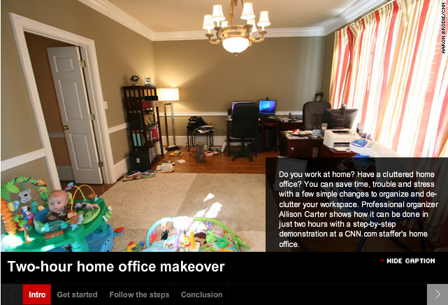
I’ve been working on some How-to instructional design materials and came across this How-to video:
I suggest you open this link[below] in a new window, so you can continue to read my comments, as you watch.
Cool ideas to streamline your home office:
The somewhat quirky presentation, I feel, lends to the home-iness of this design. Which allows the viewer to be comfortable and have a sense that ‘This is going to be ok.‘ What I really like is how well this has been compartmentalized: Intro, Get Started, Follow the Steps and Conclusion–it makes for a nicely organized feature of the presentation itself.
In Instructional Design terms, Allison Carter has included several good key design components in this video: Alison is teaching a procedure here and takes the viewer thru several steps….in her Intro and on down thru her Conclusion. So, Alison is:
- Teaching– in this case chatting conversationally about factual information–office disorganization
- Teaching the viewer about the concepts of an organized office
- Teaching the viewer new learning procedures to make their office more organized
- Teaching and showing the viewer those new learning processes–so they can re-organize their office
- Teaching the principles of how the viewer’s newly organized office will benefit them.
Alison is able to do all this Content Performance by visually organizing the: Facts, Concepts, Processes, Procedures & Principles within a ‘Display Method [the video]’ that is pleasing, fun, short, to-the-point, and has created a scenario the viewer can easily relate to.
Just read the comments, below the video, to see how readers/viewers became motivated!
I even started to look around my own office and think of ideas where I can use a little re-organization.
- Did Alison motivate you to get your home office into shape?
More Visual Thinking Strategies
I stumbled upon this site at Visual Thinking Strategies [VTS] and wanted to share. (VTS) is a research-based teaching method that improves critical thinking and language skills through discussions of visual images.
Be sure to spend the 6+minutes with this video.


