Take a moment to watch this amazing teacher, man, human being.
Inspiration
Oru Kayak
Here is a great idea that started from paper origami inspiration.
Oru Kayak is dedicated to sharing the wonder and discovery of the great outdoors— even for city dwellers. They believe spending time outdoors makes people healthier, happier, and more productive, and I think you should have a peek at what came up with. Maybe even donate to their KickStarter project?
Pebble: E-Paper Watch for iPhone
Just ordered my new Pebble….it will be shipping in September 2012….can’t wait!!!
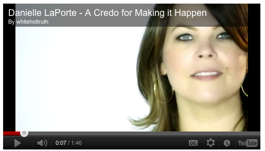
Danielle LaPorte: A Credo for Making it Happen
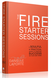
In 2010 Danielle LaPorte created the original FireStarter Sessions as a downloadable eBook chocker-block-full of fabulously excellent content and yummy videos which have inspired entrepreneurs to ‘spark your genus, ignite your business, make it matter.’ Well, Danielle now has her book out in print.
Here is Danielle’s current video….which I want to have to watch [again and again] and to share:
Based upon Danielle’s first eBook version of this now-hard-cover rendition. I HIGHLY recommend. I can’t wait to get my own copy. My big question is should I get the hard copy or a digital copy?
IF you still need convincing check out this first chapter for free.
36 UIs In 30 Locations
When to know enough is just enough. Ericsson had too much information and needed a message to communicate how a multi-purpose, multi-technology network node enables operators to meet their three priorities in relation to data traffic explosion: differentiation, control and monetization.
The above video is work that makes you jealous, inspires and does both simultaneously. The beauty of this video is that it is a great example of the changing nature of how instruction can communicate an idea [not just a product]. It shows how Ericsson moves data around, and why it matters.
The House of Radon did the creative work and really hit the nail on making sense out of a concept. The video’s message “appeals to the senses.” Data, nodes, operators, differentiation–all of these ideas in Ericsson’s brief are just so much insubstantial vapor. House of Radon’s video translates them into snappy factoids, which helps. But the idea of embedding them into physically appealing touchscreen interfaces–and then embedding those into a series of viscerally evocative first-person live-action scenelets, where just a hint of sound effects and out-of-focus background action instantly tells your five senses everything they need to know about what’s happening outside the edges of the frame–that’s what makes Ericsson’s brief make sense.
House of Radon’s relentless cutting from new interface/location to new interface/location, three dozen times, is an essential part of getting the message across. As more and more innovative companies find themselves “selling” invisible-but-essential ideas, this kind of advertising-as-sensemaking becomes more valuable than any glib “Got Milk?”-style product campaign ever could be. Does every spot need to cram in 30-odd interfaces and locations to make its point? Of course not. But the designers behind this House of Radon spot know that, sometimes, “too much” is just enough.
Jawbone’s UP Release
I follow Fast Company and this is one of those things that is just so fabulous, I wished I had thought of it. UP by Jawbone is a really revolutionary invention. You put on the wristband and then check in with your smartphone to check on: eating patterns, sleep cycles and exercise. It costs $100 and will be available at Apple, Target, AT&T stores, and Best Buy.
Travis Bogard, Jawbone’s VP of product development sums it up perfectly, “Health isn’t about going to the gym three times a week. It’s about the thousands of little decisions that you make during the day. It’s about what you do in between those ‘healthy times.'”


