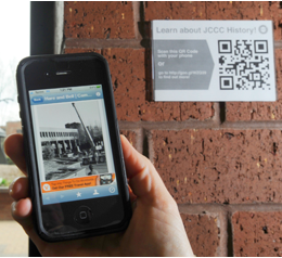
QR [Quick Response] codes can be applied anywhere you desire learning to occur. Perhaps out on campus where a QR code could be scanned to link to richer content.
Design
QR Codes Used in Lab Settings
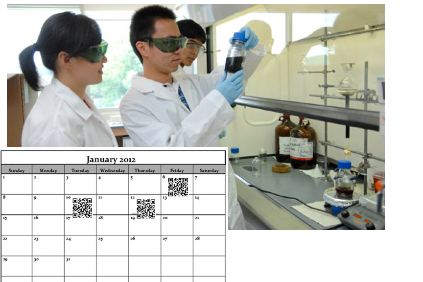
Since labs are often difficult to make-up, labs can be video recorded and QR [Quick Response] codes can be applied to a lab calendar. Students are able to scan the QR code to download the lab.
Additionally, difficult procedures can be recorded by video and/or audio and added to lab handouts for distribution before, during or after class.
3 Easy Ways to Use Mobile Devices for Learning
The Guardian US recently mentioned “the growth in online learning is likely to push universities towards greater emphasis on one-to-one tuition and other interaction with students.” In my mind meaning, a personalization of learning and what better way to personalize and connect with your online students than by using mobile devices.
Which really isn’t much different than working one-to-one with students, except now we have great tools to interact with our students and primary amongst them are mobile devices.
So, how are you using mobile technology in your classroom? Whether you meet online or in person, there are techniques you can implement.
1. Push Messages:
Use automated text messages [or voice messages] to connect with your students. Call Loop is a free [or nearly free] service that is easy to use and integrates with services you might already be using.
- Use it to remind students: of assignments that are due, dates and times of tests or just to check-in. Personalize the learning experience for your students and you’ll find deeper learning.
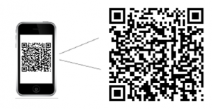
Think of these as the ‘wild child’ of the Bar Code. QR codes hold so much more information. Scanning apps can be downloaded to mobile devices and used to scan any QR code you pre-load.
- Post your homework, outside your classroom and train students to scan the code-everytime they come to class.
- Use QR Codes to link to more intense reading, video or online experiences.
3. Cameras & Apps:
Challenge yourself and your students to use the cameras and apps on your mobile device to create:
- videos
- podcasts
- even virtual meetings
The bottom line is to just get started using mobile devices within your online course. Make a list of 3 more things you could do to integrate mobile devices within your online learning. Start small and get going. Let me know if I can assist you in any way.
Prom Dress 2012
So, this year’s prom dress was slightly less complicated than last year’s dresscue. Of course, 2011 had a twisty middle and end.
This year’s dress was also inspired by a trip to NYC last December and a visit to Shareen Vintage. A girl has to start planning Prom way in advance. Post inspiration, was a trip to Osgoods for fabric and supplies and then the sewing began. Within a few weeks months the dress shaped into this: [I love that Jan got captured in the background. She was taking images as well.]
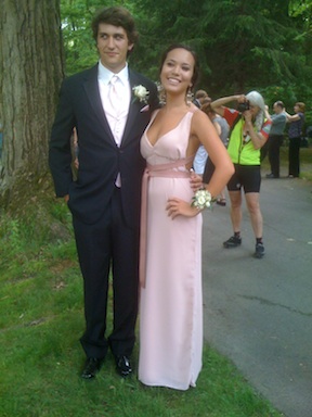 the back of the dress looks like this:
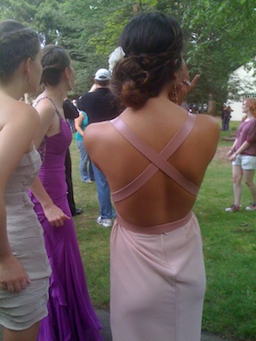 I lined the entire dress and created the straps by cutting and gluing vinyl strips together.
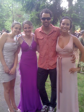
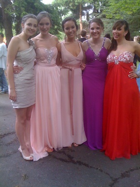
Here’s the whole gang:
 Even Brendan happened to be in town:
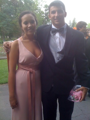
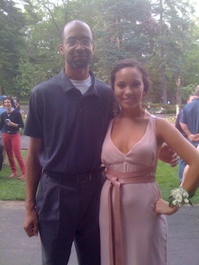
 And Mr Harp:
 And Xernay’s friend:
What will be the next Dresscue?
The Weight of the Nation
These films are a MUST see. Please take the time to watch. These are a series, so be sure to see them all.
36 UIs In 30 Locations
When to know enough is just enough. Ericsson had too much information and needed a message to communicate how a multi-purpose, multi-technology network node enables operators to meet their three priorities in relation to data traffic explosion: differentiation, control and monetization.
The above video is work that makes you jealous, inspires and does both simultaneously. The beauty of this video is that it is a great example of the changing nature of how instruction can communicate an idea [not just a product]. It shows how Ericsson moves data around, and why it matters.
The House of Radon did the creative work and really hit the nail on making sense out of a concept. The video’s message “appeals to the senses.” Data, nodes, operators, differentiation–all of these ideas in Ericsson’s brief are just so much insubstantial vapor. House of Radon’s video translates them into snappy factoids, which helps. But the idea of embedding them into physically appealing touchscreen interfaces–and then embedding those into a series of viscerally evocative first-person live-action scenelets, where just a hint of sound effects and out-of-focus background action instantly tells your five senses everything they need to know about what’s happening outside the edges of the frame–that’s what makes Ericsson’s brief make sense.
House of Radon’s relentless cutting from new interface/location to new interface/location, three dozen times, is an essential part of getting the message across. As more and more innovative companies find themselves “selling” invisible-but-essential ideas, this kind of advertising-as-sensemaking becomes more valuable than any glib “Got Milk?”-style product campaign ever could be. Does every spot need to cram in 30-odd interfaces and locations to make its point? Of course not. But the designers behind this House of Radon spot know that, sometimes, “too much” is just enough.


