I’ve always been a lover of great infographics ever since being introduced to Edward Tufts. I think this stems from my life-long-love of maps. More and more data is being turned into shorthand to aid in advancing trends in all areas of our lives. These types of presentations really help us understand our world and help us make decisions.
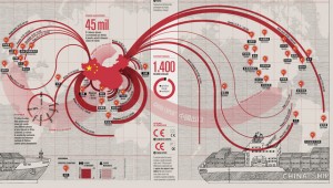
This one shows Chinese exports
Watch this brief video from Francesco Franchi, a master of information design. He talks about how you have to go beyond the picture and create an entirely different sort of experience that encourages critical thinking.
Francesco Franchi: On Visual Storytelling and New Languages in Journalism from Gestalten on Vimeo.
Sunday, The New York Times ran an article about Big Data. In it they talk about how “Data is in the driver’s seat. It’s there, it’s useful and it’s valuable, even hip.” And infographics can really help us decipher information so it becomes useful to us. For example, learning how pasta, not bacon makes us fat. Or how to make the perfect cocktail. These are really fun and useful ways infographics help us.
Corporate America is also catching on. Imagine how job aids and training could improve with some really juicy infographs. More and more companies are adopting ‘data-driven decision making’. Heck, even the government is getting in on the data.
What it all boils down to is the content. Then, placing the content into a design that really assists the viewer to ‘read’ the information in a ‘nonlinear manner’. Good infographics make the viewer think-they don’t interpret the information for the viewer.


