The Value of Data Visualization makes a compelling case for how infographics exploit visual clues like color, size, and graphic orientation to help us understand complex stories. Naturally, they use infographics to do it. Think about visual clues when creating instructional design.
Southern Breakfast at Pop’s Place
Normally my breakfast consists of: juice, half decaf coffee, fruit, some whole wheat toast & jam [or oatmeal], sometimes a scrambled egg, ever-other-day an hour and a half in the hot Bikram yoga room and a gallon of fresh water.
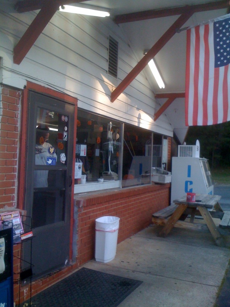
Recently, while in Atlanta working on short-term design job, I was treated to a very high carbo-loaded breakfast. This traditional and I mean traditional southern breakfast was at Pop’s Place just south of the Atlanta Motor Speedway. Pop’s is known for it’s home cooking and urban myth has it, popular with drivers racing at the Atlanta Motor Speedway.
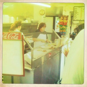
Upon entering the tiny dining/kitchen/drive-thru restaurant we asked if this really was the home of Atlanta’s best homemade biscuits. The answer; a resounding “Yes”, followed by a nearby local’s recommendation of “biscuits and gravy”.
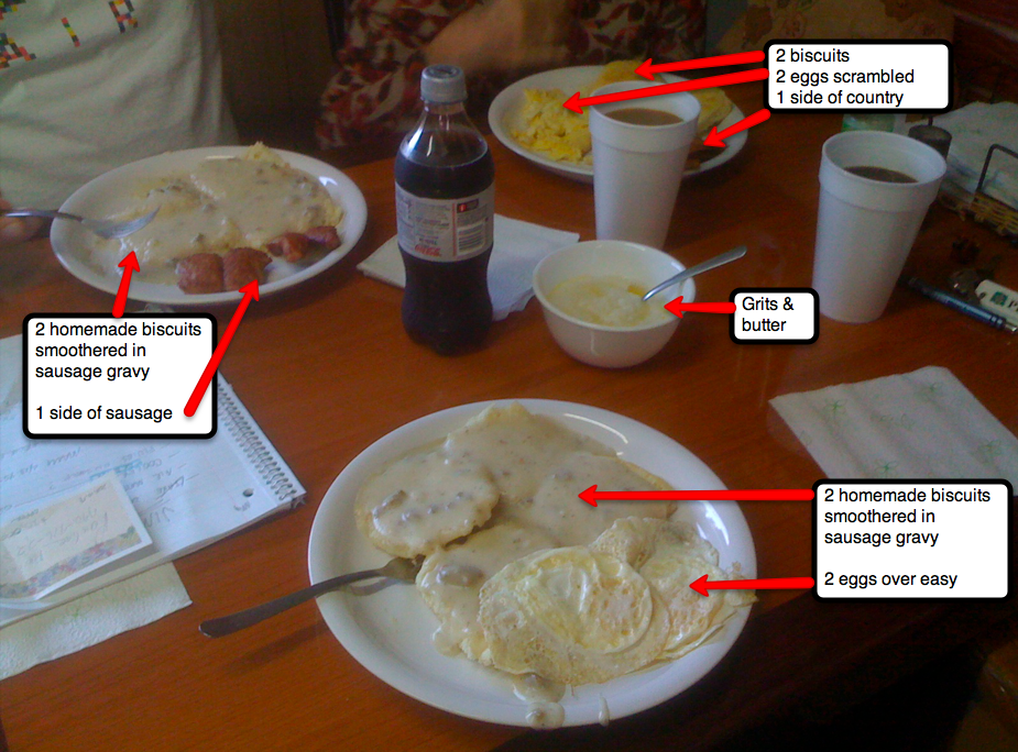
We ordered: the best homemade biscuits around with sausage gravy, eggs, sausage, country ham, grits, coffee and of course, a Coke. Now, remember, I don’t normally eat meat, however I wanted to “taste” this. The off-white plates quickly arrived to our table. The grits were as light as fluffy tapioca pudding. The biscuits; those portions not soaked by gravy were equally fluffy and the eggs perfectly prepared. How many calories in this breakfast? This IS a once in a lifetime breakfast for me.
I wasn’t able to finish the whole breakfast, but I did taste everything and enjoyed the constant parade of patrons coming thru the door and drive thru. We were treated with the very best southern hospitality during our entire breakfast, including the checkout.
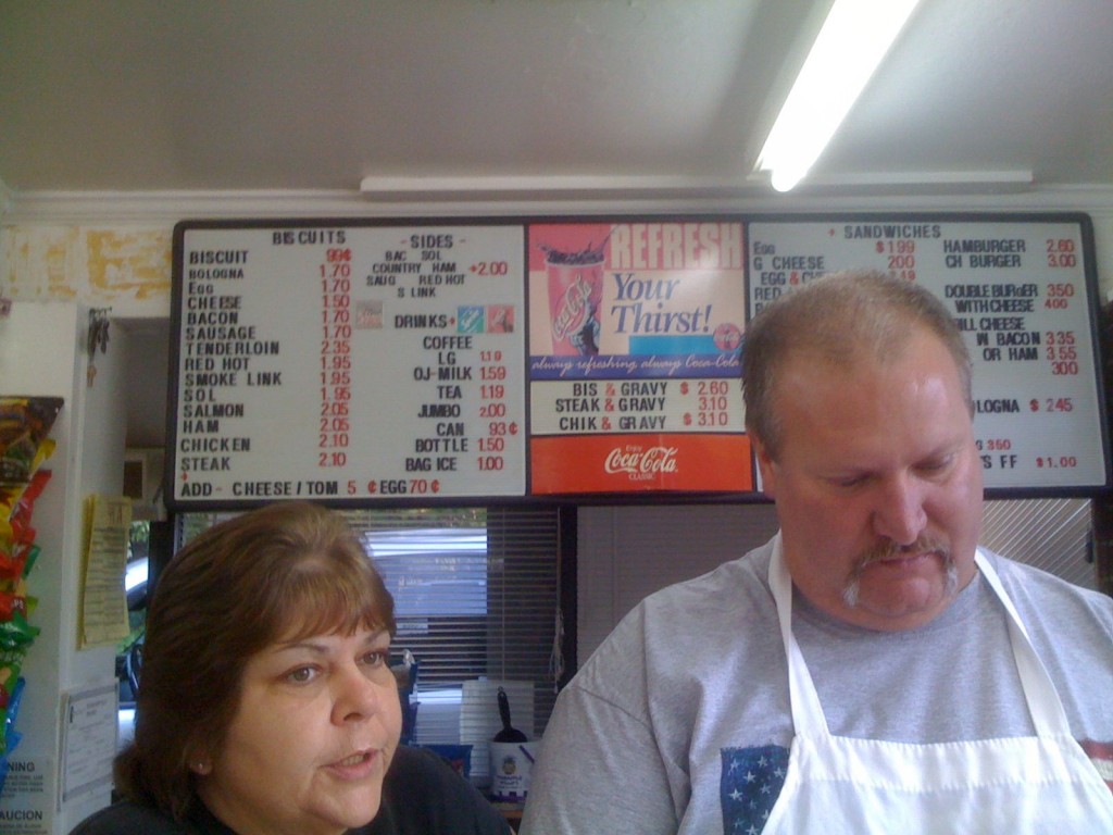
Look closely at those prices. Our total bill $16.40. I might return, and only order a biscuit, eggs and juice…maybe some of those fluffy grits.
Dresses Crafted Out of Paper
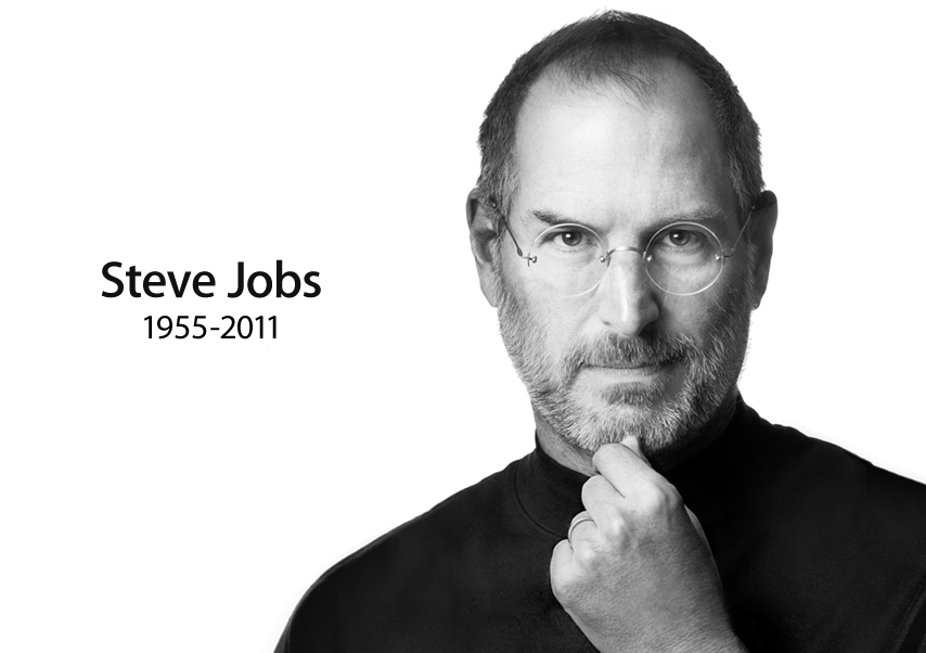
Goodbye Visionary
We need more of what Steve had. He saw something that was simply better than what had preceded it, and he was willing to gamble based on that instinct. That required an ability to think first and foremost as someone who lives with technology rather than produces it.
Jobs is perhaps the greatest user of technology to every live. He was able to think first and foremost as someone who lives with technology rather than produces it.
How-to Instructions
I’ve been working on some How-to instructional design materials and came across this How-to video:
I suggest you open this link[below] in a new window, so you can continue to read my comments, as you watch.
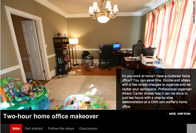
Cool ideas to streamline your home office:
The somewhat quirky presentation, I feel, lends to the home-iness of this design. Which allows the viewer to be comfortable and have a sense that ‘This is going to be ok.‘ What I really like is how well this has been compartmentalized: Intro, Get Started, Follow the Steps and Conclusion–it makes for a nicely organized feature of the presentation itself.
In Instructional Design terms, Allison Carter has included several good key design components in this video: Alison is teaching a procedure here and takes the viewer thru several steps….in her Intro and on down thru her Conclusion. So, Alison is:
- Teaching– in this case chatting conversationally about factual information–office disorganization
- Teaching the viewer about the concepts of an organized office
- Teaching the viewer new learning procedures to make their office more organized
- Teaching and showing the viewer those new learning processes–so they can re-organize their office
- Teaching the principles of how the viewer’s newly organized office will benefit them.
Alison is able to do all this Content Performance by visually organizing the: Facts, Concepts, Processes, Procedures & Principles within a ‘Display Method [the video]’ that is pleasing, fun, short, to-the-point, and has created a scenario the viewer can easily relate to.
Just read the comments, below the video, to see how readers/viewers became motivated!
I even started to look around my own office and think of ideas where I can use a little re-organization.
- Did Alison motivate you to get your home office into shape?
Designing Online Learning
When I am designing an online course, I use lots of check lists and charts to help guide me. Then, when reading an articles on Three Keys That Make Good Interaction Design Great, these words stood out to me:
- Optimizing: Making daily activities more efficient
- Engaging: Capturing attention, creating delight and delivering meaning
- Empowering: Enabling people to go beyond their limits
- Expressing: Encouraging self expression and/or creativity
- Connecting: Facilitating communication between people and communities
- Disrupting: Re-imagining completely an existing product or service by creating new behaviors, usages or markets.
Hello, this list can be used to double check an online course. Are these being represented in the course I’m designing? Why can’t a check list, like this one, be used to help create some dynamic online design? I say “Yes it can!”


