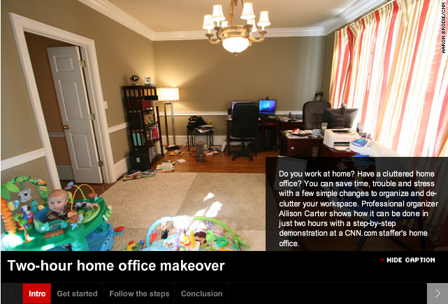
I’ve been working on some How-to instructional design materials and came across this How-to video:
I suggest you open this link[below] in a new window, so you can continue to read my comments, as you watch.
Cool ideas to streamline your home office:
The somewhat quirky presentation, I feel, lends to the home-iness of this design. Which allows the viewer to be comfortable and have a sense that ‘This is going to be ok.‘ What I really like is how well this has been compartmentalized: Intro, Get Started, Follow the Steps and Conclusion–it makes for a nicely organized feature of the presentation itself.
In Instructional Design terms, Allison Carter has included several good key design components in this video: Alison is teaching a procedure here and takes the viewer thru several steps….in her Intro and on down thru her Conclusion. So, Alison is:
- Teaching– in this case chatting conversationally about factual information–office disorganization
- Teaching the viewer about the concepts of an organized office
- Teaching the viewer new learning procedures to make their office more organized
- Teaching and showing the viewer those new learning processes–so they can re-organize their office
- Teaching the principles of how the viewer’s newly organized office will benefit them.
Alison is able to do all this Content Performance by visually organizing the: Facts, Concepts, Processes, Procedures & Principles within a ‘Display Method [the video]’ that is pleasing, fun, short, to-the-point, and has created a scenario the viewer can easily relate to.
Just read the comments, below the video, to see how readers/viewers became motivated!
I even started to look around my own office and think of ideas where I can use a little re-organization.
- Did Alison motivate you to get your home office into shape?


